Understanding Image Resizing: Basics and Benefits
Boost site speed & SEO with top image resizing & optimization tools: master JPEG, PNG, WebP compression, automation, quality tips, audits & metrics.
image4io
Tag
Responsive images are techniques that allow a website to serve different image sources tailored to the user's device characteristics, such as screen size, viewport width, and pixel density (DPR). Using HTML attributes like srcset and sizes on the <img> tag, or the <picture> element, enables browsers to download the most efficient image version—one that looks sharp without wasting bandwidth on excessive pixels. This is essential for performance and quality across diverse devices.
Boost site speed & SEO with top image resizing & optimization tools: master JPEG, PNG, WebP compression, automation, quality tips, audits & metrics.
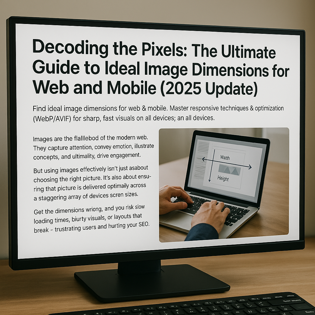
Find ideal image dimensions for web & mobile. Master responsive techniques & optimization (WebP/AVIF) for sharp, fast visuals on all devices.